Colors & Typography
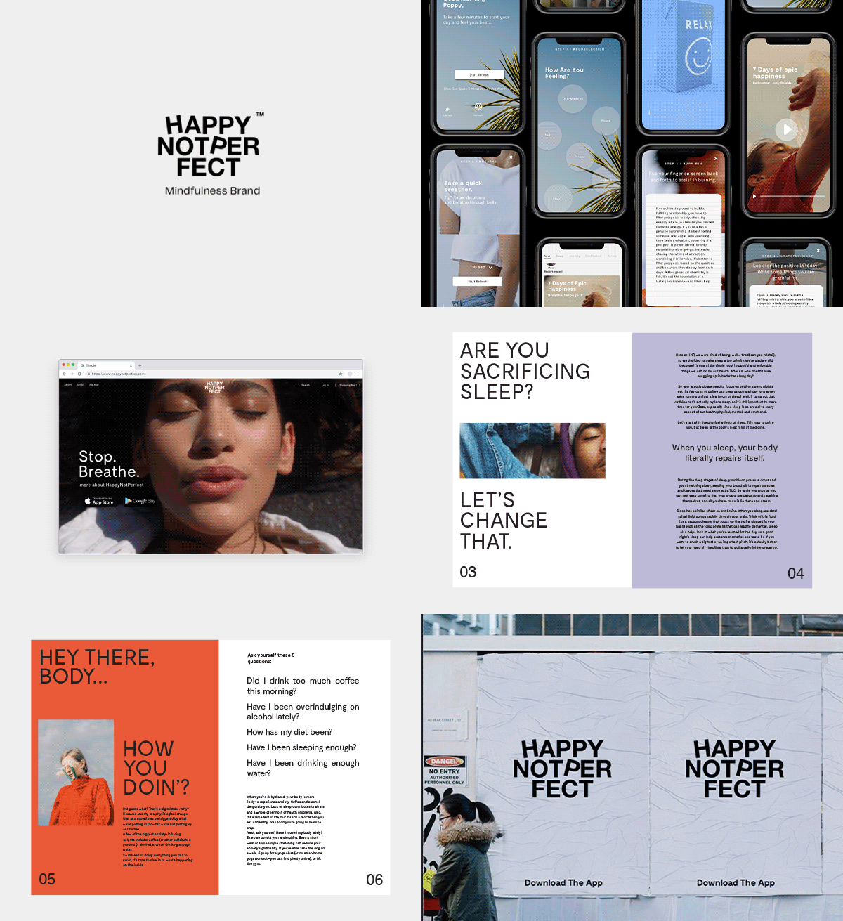
We went with Calm, Cool, colorway. We thought about the idea of “ Looking Up” and what do you see when you look up. So we focused on different shades of blue. We knew we wanted to utilize two fonts, one that would play well with the application and one that would be expressive, human, and most of all not perfect.
Web Design
One Page Landing Site designed to act as portals to the clients products, application, and social content. We utilized visual content we developed.


UX/UI Design
We worked alongside the founder and team to realign the existing process and user flow providing visual content to support .

Social
In order to keep the process lean and minimal, we devised a post index centered around two posting styles one that shared positive reinforcement as well as human connectivity.


Brand Bible
The Brand Bible is essential to bringing brand cohesion.


